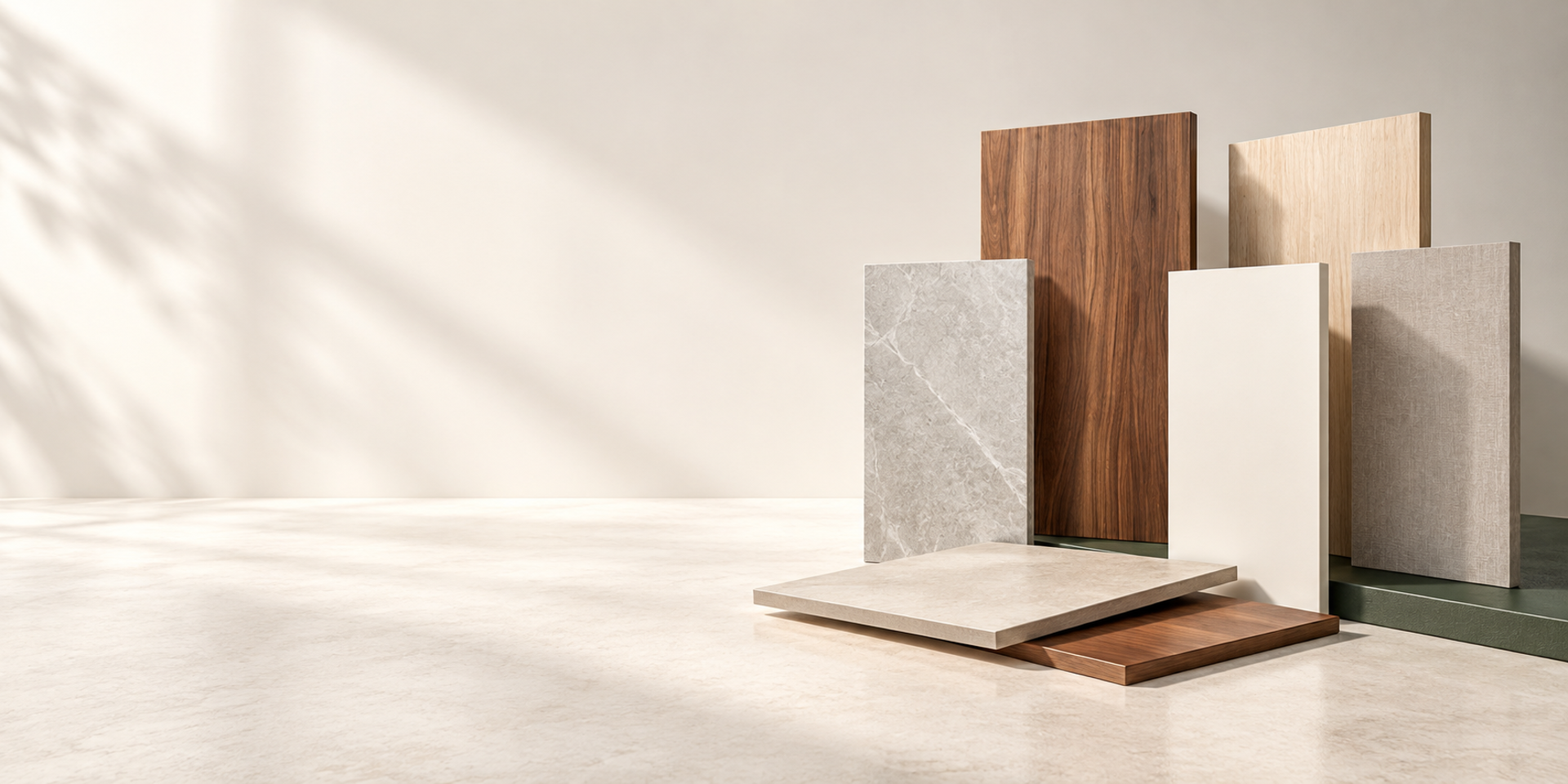


/ Material selection inspiration
How to present a soft spatial luster with PETG matte finish_copy
Find a more relaxed material expression through the combination of touch, light and shadow, and template.
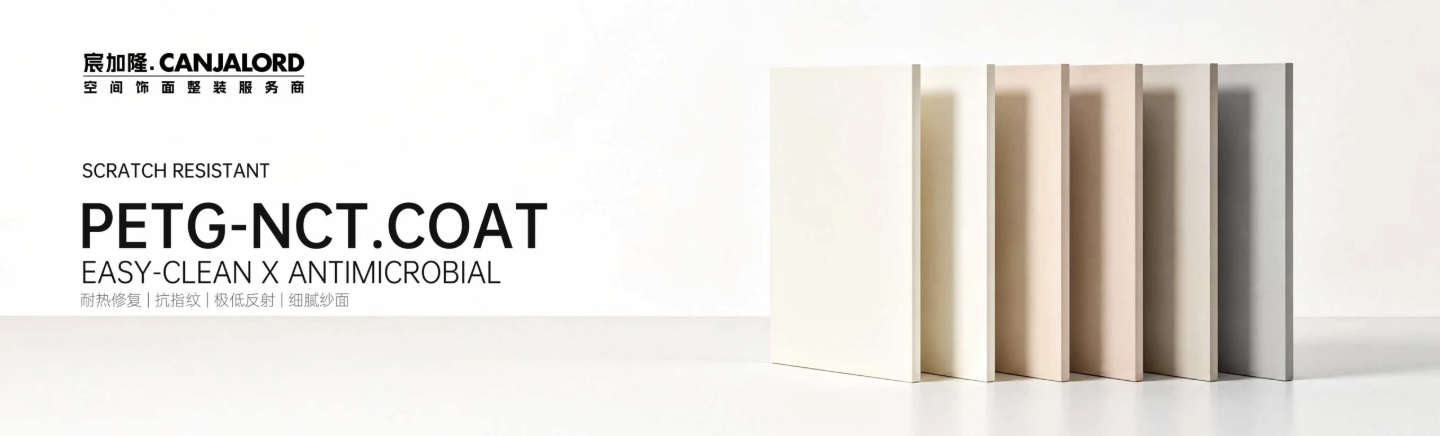
Revisiting Materials Through Three Perspectives
curate material selections tailored for everyday spaces.
A refined surface is more than just color.
When materials enter a space, light, texture and surrounding hues jointly shape our perception. For this reason, the choice of PETG matte finish should never rely solely on a color swatch. We start with physical samples, exploring how to build a gentle, calm visual backdrop for walls and cabinetry through a clearer material hierarchy.
This piece draws on material references and spatial matching strategies, linking visual appearance and coordination logic into one cohesive narrative. From fine surface details up to the overall light and shadow rhythm of a room, every decision becomes tangible when samples are laid side by side for comparison.
Subtle sheen: begin by observing light
When selecting finishes, colors on a swatch are only the starting point. The same sample can read differently beside a window, under ceiling lights or around cabinet corners. Instead of judging colors in isolation, place samples inside the intended space and let natural daylight and artificial lighting guide your evaluation.
View the surface head‑on and from an oblique angle. Check for distracting highlights, heavy shadows, and tonal harmony where cabinet doors meet. A matte aesthetic does not demand zero variation — it calls for restrained shifts that let materials recede as the quiet backdrop of a room.
Bring tactility back to everyday reach
Materials are meant both to be seen and handled daily. Cabinet doors, sideboards and entryway storage sit at different viewing and touching distances. Close‑up surface details and tactile feedback deserve equal consideration alongside cabinet proportions and hardware choices.
Stand samples upright and view them from your normal usage distance. Not every grain needs to draw attention. For large cabinet panels, consistent tone and clean joint lines establish order; open shelving and accent zones may carry more pronounced material character.
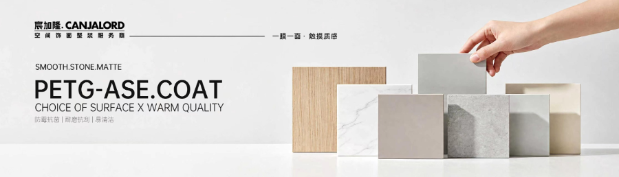
PETG-ASE.COAT · Compare solid hues, wood grain and stone grain under unified lighting
Test sample combinations before picking individual finishes
A cohesive material palette usually features a base tone, accent textures and a few dark focal details. When soft warm PETG serves as the cabinet foundation, lay wood, stone and hardware samples alongside it to compare brightness, temperature and grain direction — rather than selecting each element separately and hoping they fit later.
Wood grain can anchor reading nooks, open shelving or feature walls, while solid finishes link adjacent cabinetry and wall surfaces. Once grouped, re‑evaluate under the planned lighting scheme to maintain a clear hierarchy day and night. Material variation should support the space, not add visual clutter.
Three points to check before finalizing your finishes
From a single sample to a complete space
The true value of materials lies in how people live alongside them. Side‑by‑side comparisons and varied viewing angles clarify the relationships between color and surface. Start with samples, let light tones, textures and details settle into their rightful places, and a gently balanced interior will naturally emerge.
/ Material selection inspiration
返回新闻动态